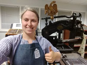
 Tradition meets modernity with the 'printing press selfie'.
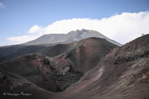
 As I've mentioned previously, I am currently working on an article on volcanoes, and the ways in which early modern and modern (for my purposes, roughly 1600-1800) perceptions of them were informed by classical understandings. I am focussing particularly on Mount Etna, albeit with a sideways glance at Vesuvius: a volcano which, in my period, Etna was generally seen as superior to, but to which it has arguably given over the greater claim to fame in the present day.
Meanwhile, in my spare time (hollow laughter) I have been working with The Scots Antiquary to get the Pathfoot Press, at the University of Stirling, off the ground. The Pathfoot Press is the proud possessor of a couple of traditional handpresses (one a huge, beautiful, Victorian Columbian Press, the other a newer, 'tabletop' Adana), and an overwhelming array of font and other equipment vital to the setting and printing of pages of text by hand. The Scots Antiquary and I have been printing together for almost as long as we have known each other, and as an early modern historian I adore it: painstakingly setting type and pulling impressions following more or less the same process by which the Gutenberg Bible was produced over 500 years ago.
However, I never expected my printing and my volcanic interests to intersect, as they have done so recently. I have just started reading - with great pleasure - Gareth Williams' just-published Pietro Bembo on Etna: The Ascent of a Venetian Humanist. This traces the literary context and impact of Pietro Bembo's account of climbing Etna, which I wrote about on this blog a few weeks ago. Early on, Williams asserts that Bembo's published account was extraordinary not only in its content but also in its typography. Bembo's De Etna was published in 1495 by the Aldine Press in Venice, and his slim volume was the first outing for a brand-new font designed for the press. That font survived four centuries of changing typographical tastes to be revived in the 1920s as a modern 'Monotype' font, which went on to be used by publishing houses ranging from Penguin to Oxford University Press. This font was named after not its original designer, but the first author to be published using it: Bembo.
At the risk of becoming geekily enthused about typography, Bembo is a lovely font: serif (meaning it has lines at the end of letter-strokes, like the font for this blog, rather than 'sans-serif', like Arial or Calibri), clean but elegant. It is one of the three fonts of the Pathfoot Press: when your font is made of metal and comes in huge typecases, with a drawer for each individual point-size, rather than as a few kilobytes of electronic code, you can't have terribly many. I had printed with it many times, without making the association between it and Pietro Bembo: if I had thought about it at all, I imagined it was a coincedence.
So Williams' book made me look into the font with redoubled interest, and it was here that one of the questions of my nascent article - what distinguished or distinguishes one volcano (Etna) from another (Vesuvius)? - and the modern reception of typefaces collided. If you type the name of any font - Times New Roman, Cambria - into Google Images, one of the first results will be the Wikipedia infographic: a smart, two-tone box containing an alphabetic and numeric sample of the font, alongside its name, and a word deemed representative of the use, history, or flavour of that font. For example, Times New Roman, the most commonly-published font in modern history, is sampled with the word 'Publisher'.
One might expect, therefore, that the Bembo font might be sampled using the word 'Etna', or even 'humanism'. Instead, as the infographic below shows, it is instead advertised through the word 'Vesuvius'.
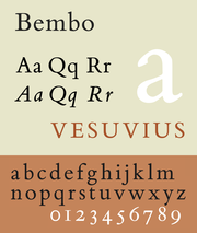
By Blythwood, CC BY-SA 4.0.
There are, of course, practical reasons for this, which as a printer I am very much aware of: 'Etna' is a short word, which does not provide a good sample of the font, and 'Mount Etna' would differ from the standard format of these infographics by offering two short words rather than one long one.
Nevertheless, for all that I am wary of reading 'too much into it', I had to smile at the serendipity with which this intersected with the thoughts and questions currently running through my mind. To what extent - in the early modern mind, in how I should frame my article - do understandings of 'Etna' and 'Vesuvius' truly bleed into one another? Are they utterly interchangable as two geomorphological features which behave in fairly similar ways? Or instead are they somewhat akin to, say, Bembo placed alongside Caslon: two old-face serif fonts, which are the same at first glance, but which to the eyes and a hands of a printer have utterly different natures?
Nevertheless, for all that I am wary of reading 'too much into it', I had to smile at the serendipity with which this intersected with the thoughts and questions currently running through my mind. To what extent - in the early modern mind, in how I should frame my article - do understandings of 'Etna' and 'Vesuvius' truly bleed into one another? Are they utterly interchangable as two geomorphological features which behave in fairly similar ways? Or instead are they somewhat akin to, say, Bembo placed alongside Caslon: two old-face serif fonts, which are the same at first glance, but which to the eyes and a hands of a printer have utterly different natures?
 RSS Feed
